
Saving my boss from getting sued: Accessibility Audit

After the owner of a small business, Regent Coffee was unexpectedly sued for web accessibility, he needed to figure out what components of his site were considered inaccessible so that this issue could be avoided in the future.
Problem:

I was hired to identify what was inaccessible according to WCAG AAA requirements and fix those issues. However, as a people focused UX Designer, I wanted to use both guideline compliance and manual testing. This way, I would not only prevent the issue from arising in the future, but would genuinely improve the web experience for those who may be visually impaired.
Proposed Solution:
Grace proctoring a manual accessibility test for visual impairment
With a combination of accessibility check tools and manual testing, I was able to improve the Lighthouse Accessibility score from an 86 to a 96. Read the entire case study for how I achieved this.
Measured Result:
WCAG Principles

To begin, I researched the WCAG and their principles to establish minimum requirements throughout the process:
Perceivable
Operable
Understandable
Robust
Tools for Identification
I knew I would begin with using existing tools online to scan the site for things invisible to the eye like color contrast, broken links, long alternative text etc... The two tools I used to conduct automatic audits of the site were:
WAVE Accessability
Chrome Developer Tool: Lighthouse
What was fixable:
As the shop owner had his site built by a custom web designer who lives overseas, I could only make immediate changes to the issues fixable from within Shopify’s editing suite. The custom code fixes were sent to the original site builder.
Scanned Audit Results
Fixable through Shopify:
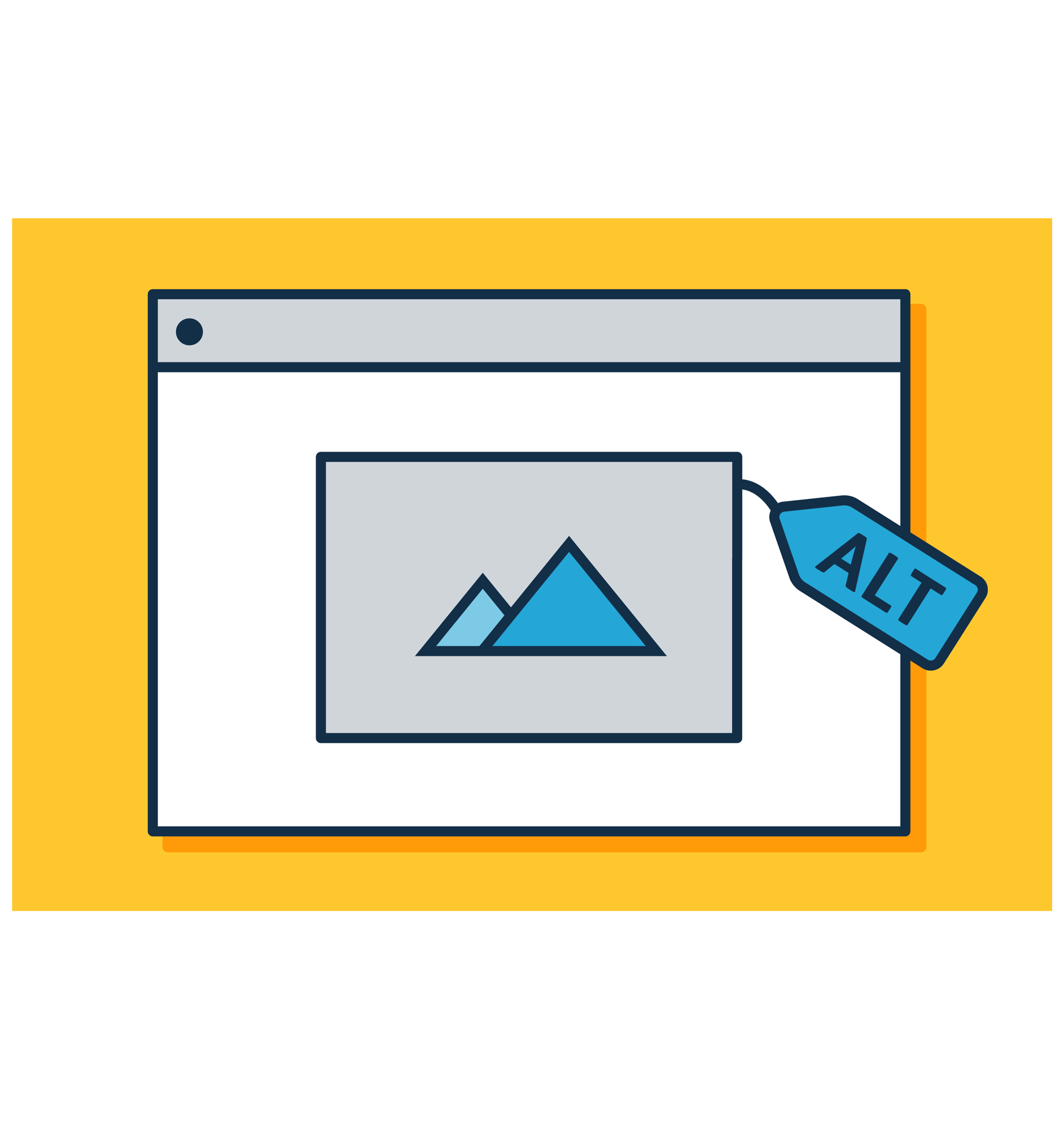
Alternative Image Text: Alt text was long illegible titles like “awug1934y2giyg\\j472”. Goal was to make it short, clear and simple!
Text color and weight: Text requirements did not pass AAA Compliance. Goal was to make the color contrast and the small thickness of the body text easily perceivable
Fixable through custom code:
Invisible link in the footer of the site.
Multiple Form Labels
Announcement banner with three rotating links that may be missed by screen readers. (Issue caused by focusable descendants)
What was corrected:
Alternative Text

Since Alt text is used by screen readers for the visually impaired, alt text must be:
Non-redundant of site or product titles
A clear and concise description of what is in the image
The Regent site product photos were either named the exact same as the product itself or were an illegible string of letters and numbers.
Color Contrast
The previous design of the site had Color Accessibility that only partially passed the AA grade. When looking to improve color contrast, I aimed to achieve AAA to make sure that the site was highly accessible. I used Accessibility Checker to monitor what was “AA” and what was “AAA.”
The images here display the two color themes on the site that were originally below “AA” grade and were updated to passing the “AAA” grade.
Manual Testing
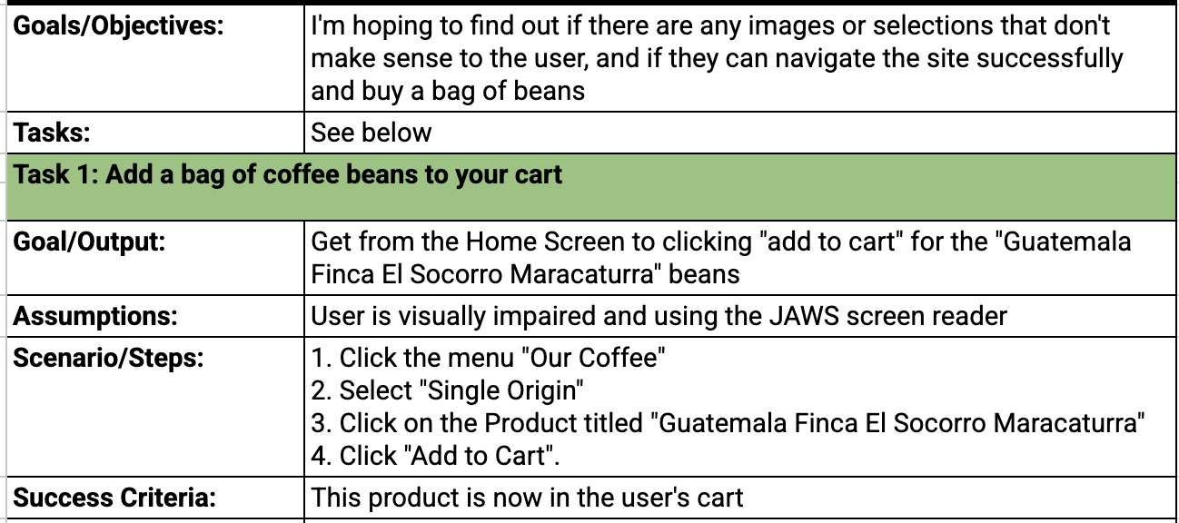
I spoke with sighted people in lieu of visually impaired people, so I proctored a blindfolded test using the industry standard screen reader software: JAWS.
I wanted to test the clarity of the Alternative text; the part of the website with the most opportunities to listen to alternative text through a screen reader was the Single Origin coffee bean shopping page. So I planned to assign my testers these 4 clicks:
Click the menu "Our Coffee"
Select "Single Origin"
Click on the product titled "Guatemala Finca El Socorro Maracaturra"
Click "Add to Cart".
Plan:

I tested 3 individuals and learned a lot about the quality of my test each time. Most notably: I needed to give the individual a short 5 minute training on what a screen reader is and how to use it before asking them to put on the blindfold.
The first tester said he felt “worried and overwhelmed” that he was going to miss the buttons he needed to click. So for my second two testers, I conducted the training without blindfolds on a separate site and showed them what focused states looked like when scrolling through clickable items. This helped them imagine the site better when doing the actual test.
Learnings…
What needed fixing:

There were two main issues we found during the second two tests:
The order in which you hear product buttons were misleading. When toggling through the products on the Single Origin page, you will hear in this order:
Quick Shop
Quick Add
“Name of Product/Image” and Price
**If you do not know which product the quick add buttons relate to, you will not be able to confidently use them. The product name needs to be first before the quick shop or quick add options.
My Alternative Text caused confusion as the user was listening for the name of the product versus the image description first. “12oz bag of coffee beans on a rock shaded by a branch” took the user out of the headspace of looking for the product named “Guatemala Finca El Socorro” I can adjust the image alt text to include the product name first and then describe the setting of the bag afterwards int he context of an e-commerce site.
Fixes after manual testing:
What was fixable on Shopify:
I was only able to implement one of two above fixes in the Shopify editing suite as to not tamper with original custom code: Alternative Text. Here, I’ve displayed the before and after Alternative text to better communicate both what the image shows as well as which product it pertains to.
“12oz bag of coffee beans on a rock shaded by a branch”
“12oz bag of Guatemala Finca El Socorro Maracaturra sitting on a shaded rock”
Fixable through custom code:
Reordering the Quick Shop, Quick Add, and Product links within the Product Components. This issue was sent to the engineer who originally built the site for Regent Coffee.
The invisible link with an “x” image to close the search bar in focused state is unnamed when toggling over it, leaving the visually disabled user unsure of what the button does.
Measurable Results after the Audit:

Using Waves, Lighthouse, and Manually testing with the JAWS Screen reader, I improved the Lighthouse Accessibility score from 86 to 96. This will majorly help prevent a lawsuit for this small business in the future.
I also identified 3 hurdles invisible to automatic audit software that prevented ease of use for visually impaired folks through my manual testing with three individuals.
Thanks to this audit process, the goal to both protect the business from future lawsuits and to create a clearer and easier experience for visually impaired patrons was achieved.